In the last article that I posted here I dug into what an experimental design to test the ease of use of a service design might look like. If you haven’t read that article, you definitely should read that article before reading this one because I’m going to skip a lot of the set up and description of the project, the data, and the code. As with last time, the repository for the code and the data for this article lives on Github. Now, with that out of the way, last time we found some interesting things in our experiment, but we left it with a lot of big outstanding questions that need some answering. Here are the big takeaways and the todos:
- We had some data that showed the results of a randomized experiment on website redesigns for multiple touchpoints in a complex service.
- Using a Kolmogrod-Smirnov test, we proved that our experiment did, in fact, have a result: our redesigns didn’t make people faster at using the service, but it did make them rate it more highly overall. These are encoded in our data as SatisfactionWithWebsite.
- Unfortunately, the ratings that we get still aren’t good. Here’s what our ratings looked like for people who did get at least one of our redesigns:
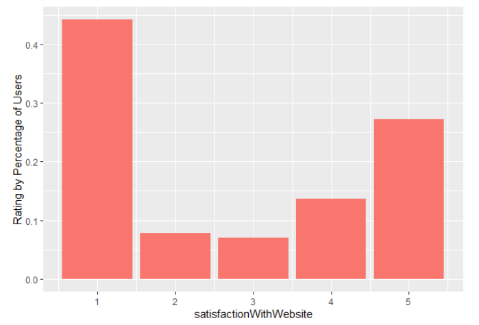
Website satisfaction for treatment users
- That said, though, the ratings for our redesigns are slightly better and they improve the more redesigned touchpoints that people get:
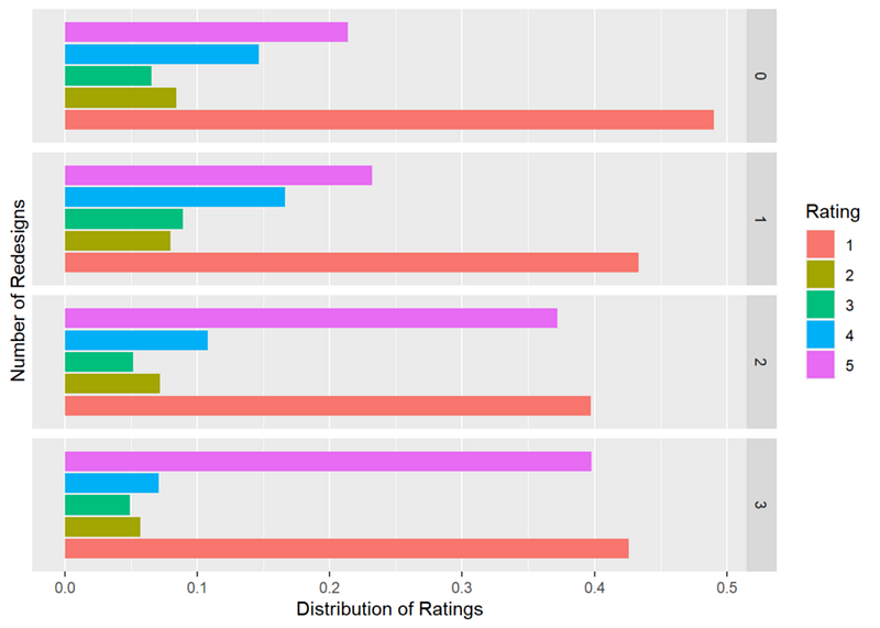
Website satisfaction by number of treatments
So onto our problem for this article: we see that people dislike the service less when they use the redesigns. The problem is that we can’t really just say that a higher rating actually means that it’s easier to use because so many people don’t rate the website, they rate some other part of the service where they finish their tasks, like the phone service, or the representative. This is fairly common in the world of designing complex services, especially where completion of tasks can involve multiple touchpoints and feedback rates on those tasks is often extremely low.
The other way that people express how easy the website is to use is by transferring to the automated phone service. This is encoded in our data as TransferredToAPS. This presents us with a problem: which tells us what captures ease of use: the transfer or the rating? How do we know that our designs really make something easier to use?
Dealing with Bimodal Distributions
Before we get into the problem of understanding what best measures ease of use, we have to deal with one of the things that we can understand quantitatively: ratings. The biggest problem with our ratings is that they’re bimodal. That means that we can’t easily run linear regressions on them (our r-squared ratings were very poor when we did) nor can we easily use many of our other statistical tools. Things like mean or median, standard deviation or median absolute deviation, quantiles, skewness, and kurtosis all become somewhat meaningless when you have a strong multimodal distribution. One strategy is to think about this distribution of ratings as being actually two different distributions that represent two viewpoints: people who find the service easy to use and people who don’t. This is similar to how statisticians approach bimodal distributions with many more possible values than our 1–5: they decompose them into two different distributions that are closer to normal distributions and then work with those two distributions as though they’re two different groups. Remember from the previous article that every one of our users left a rating and they rated wherever they finished up, e.g. if they did everything on the website, they left a website rating, if they transferred to the phone service, they left a rating for the phone service, and if they transferred to a representative, they left a phone rep rating. We can make a column that represents whatever rating we got like so:
df$satisfaction <- ifelse( df$satisfactionWithWebsite > 0, df$satisfactionWithWebsite, ifelse(df$satisfactionWithAPS > 0, df$satisfactionWithAPS, df$satisfactionWithRepresentative))
Now we can look at all of our ratings and make sure that our distribution actually is multi-modal. To do this, we use Hartigans Dip Test of multimodality:
dip.test(df$satisfaction)
This returns:
Hartigans’ dip test for unimodality / multimodality

data: df$satisfaction
D = 0.1416, p-value < 2.2e-16
alternative hypothesis: non-unimodal, i.e., at least bimodal
So we have a strong indication that our reported satisfaction across all of our touchpoints is multi-modal. That D is very high (relatively speaking) and the p-value is very very low. Let’s see if we do in fact have the bimodality that we think we see:
library(BSDA)
dstamp <- density(df$satisfaction, bw=1, kernel = “gaussian”)
chng <- cumsum(rle(sign(diff(dstamp$y)))$lengths)
plot(dstamp, main=”Detected Modes of Ratings”)
abline(v = dstamp$x[chng[seq(1,length(chng),2)]])
This gives us pretty good evidence that we do in fact have two groups:
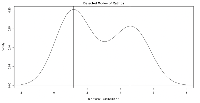
Modes at somewhere around 1 and somewhere around 4.5
So at this point we have good evidence that we do in fact have two different distributions. We can think of these as a binomial distribution which contains people who don’t like the service (those centered around 1) and those who do like the service (centered around 5). This could (and should, reasonably) indicate that we have a something that’s being expressed in our ratings. So we’ve touched in the idea of our data representing two different attitudes expressed in the ratings, but that hasn’t touched on the bigger problem that we have: there are other ways that people express how easy they find the website. They can give it a high or low rating or they can transfer to the phone service. Either one of those things express something that we can’t quite measure: that elusive ease of use. There’s an idea that will help us parse this a little better and that’s the idea of a latent class.
What’s a Latent Class?
A latent class is a qualitatively different subgroup within a population that shares certain outwardly identifiable characteristics. Latent Class Analysis (LCA) is the process of finding out what those groups are and figuring out what measurable characteristic they have. The assumption that undergirds LCA is that membership in a group (or class) can be explained by patterns of scores across survey questions, assessment indicators, or scales.
A latent class model uses the different response patterns in the data to find similar groups. It tries to create and assign groups that are “conditional independent”. This means that inside of a group, the correlations between the variables should be zero, because any relationship between variables is explained by the group membership.
We have a few ways that people can express membership in the ‘easy to use’ group: they can not transfer to the APS or they can give the website a high rating. Either one says “yes, I can use this”. Our transfer value is a binary outcome variable, you do it or you don’t. Our rating is a polytomous outcome variable which means that it has multiple values. In order to figure out whether someone is in the “finds it easy to use” group or not, we need to know whether they transfer and whether they give it a high rating. This is part of why in the previous article, I wasn’t all that excited about the regressions that we did: they were missing part of the picture.
Enter poLCA, a software package for the estimation of latent class models and latent class regression models for polytomous outcome variables.
As the Github Page says:
Latent class analysis (also known as latent structure analysis) can be used to identify clusters of similar “types” of individuals or observations from multivariate categorical data, estimating the characteristics of these latent groups, and returning the probability that each observation belongs to each group. These models are also helpful in investigating sources of confounding and nonindependence among a set of categorical variables, as well as for density estimation in cross-classification tables. Typical applications include the analysis of opinion surveys; rater agreement; lifestyle and consumer choice; and other social and behavioral phenomena.
That is exactly what we’re looking to do! So let’s get into it.
First, we need to pick who we’re interested in: people who started on the website and either used the website or the APS.
polca_recode <- df[startedOnWebsite == 1 & transferredToRep == 0,]
Second, we need to make the data fit with what poLCA wants and what poLCA wants is data that starts at 1. No zeros allowed.
polca_recode$redesign <- polca_recode$redesign + 1
polca_recode$usedHelp <- polca_recode$usedHelp + 1
polca_recode$previousWebsiteUser <- polca_recode$previousWebsiteUser + 1
Third, we want to flip our transfer coding so that 2 means “didn’t transfer” and 1 means “did transfer” so that the “positive” result is numerically higher than the negative:
polca_recode$transferredToAPS <- 2 — polca_recode$transferredToAPS
Now we can build a model for the users who didn’t get any redesigns:
no_redesign <- poLCA(
  cbind(satisfaction, transferredToAPS, usedHelp) ~ 1,
  nclass=2,
  data=polca_recode[redesign == 1,],
  nrep=1,
  na.rm=F,
  graphs=T,
  maxiter = 100000
)
Latent Classes for control in poLCA
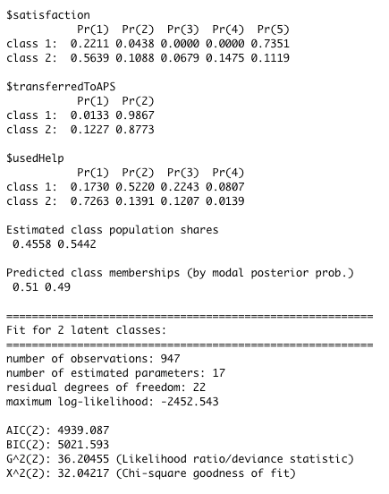
What this tells us is that we have two classes: one more likely to give a low score and less likely to use the help and another class more likely to give a high score and more likely to use the help. They’re both equally likely to transfer. Our guess is that about 60% of the people who got no redesigns are in the “low score and no help” class and about 40% are in the “high score and maybe help” class. That might not seem quite right because, as you remember, the ratings for folks who didn’t get any redesigns weren’t great. But poLCA is splitting based on the people who gave the service a 1-2 and the people who gave it a 3–5, which is going to balance us out slightly more. Now let’s look at people who got all of the redesigns:
redesign_mod <- poLCA(
   cbind(satisfaction, transferredToAPS, usedHelp) ~ 1,
   nclass=2,
   data=polca_recode[redesign == 4,],
   nrep=1,
   na.rm=F,
   graphs=F,
   maxiter = 100000
)
Latent Classes for all treatments in poLCA
What this tells us is that we have two classes: one more likely to give a low score, unlikely to transfer, less likely to use the help and another class more likely to give a high score and more likely to use the help and very unlikely to transfer. Our guess is that about 50% of the people who got no redesigns are in the “low score and maybe transfer” class and about 50% are in the “high score and no transfer” class.
Using these two classes as comparisons we can finally get an accurate picture of our two classes across our control group and our experiment group. We do need to be careful comparing directly across our two groups since they’re not directly equivalent but we can make a very reasonable argument that the redesigns seem to find the service easier to use. This comparability problem might give us an idea: what if we just include the redesigns as yet another variable in our LCA?
We can use the R notation for a regression formula, the structure that at its most basic looks like this:
y ~ x
This says that we regress y on x and we hopefully get something that tells us that for an increase of 1 in x we get some statistically significant and meaningful increase in y. The interesting thing about poLCA is that it lets us use a similar formula. We could say:
cbind(satisfaction, transferredToAPS, usedHelp) ~ redesign
Which says: we think that satisfaction, transferring, and using the help are all influenced by the number of redesigns. This is essentially the DAG that we posited here and we finally have a way of determining it.
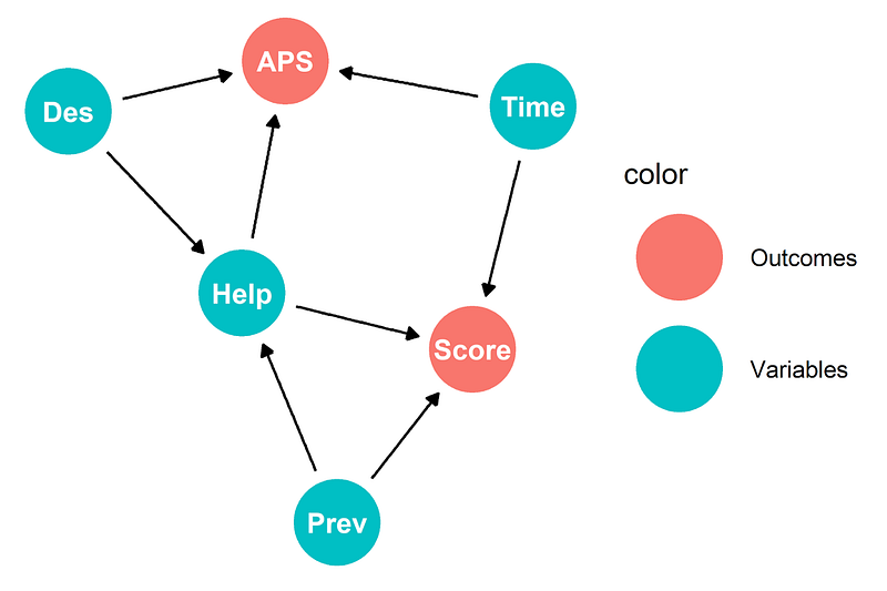
Our original Directed Acyclic Graph
Fantastic! Our call to poLCA now looks like this:
polca_all <- poLCA(
   cbind(satisfaction, transferredToAPS, usedHelp) ~ redesign,
   nclass=2,
   data=polca_recode,
   nrep=1,
   na.rm=F,
   graphs=F,
   maxiter = 100000
)
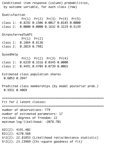
We think there are two classes, we think that we think that satisfaction, transferring, and using the help are all influenced by the number of redesigns, and we want to know exactly how much that is the case. We get back:
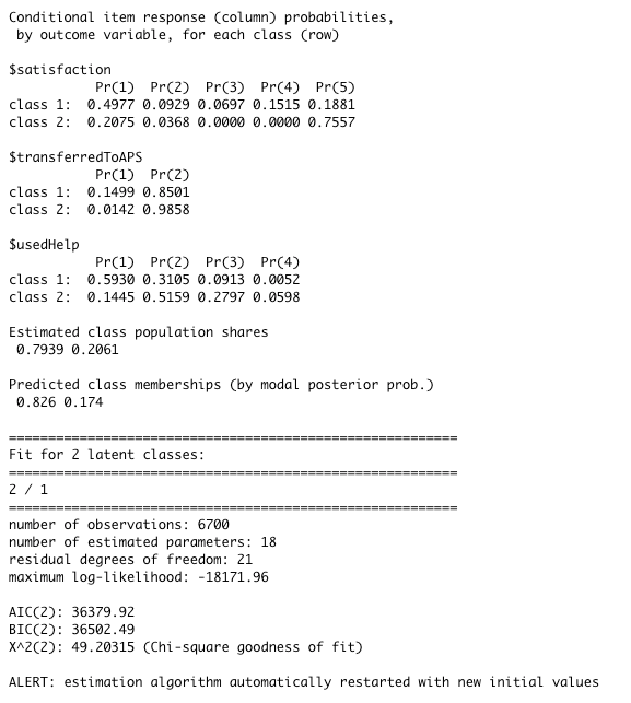
Latent Class Regression in poLCA
Now we see two classes: one much more likely to rate the service highly, use the help, and less likely to transfer, another much more likely to rate the service lower, not use the help, and more likely to transfer. Our memberships are confusing here: only about 18% of our overall users are in this “ease of use” class. But remember, not that many of our users were getting many of the redesigns. So we can say these classes represent is our ease of use “yes” and ease of use “no” when users do in fact are selected for the experiment. But what about the effect of the redesigns themselves? When we use a regression, poLCA also gives us back this:
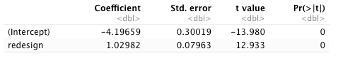
Now this is tricky to parse, but what it says is that the log-ratio prior probability that a respondent will belong to the “ease of use: yes” group with respect to the “ease of use: no” group is −4.2 + 1.02 × redesign. Less redesigns: rather unlikely to belong to the “yes” group. When a user has the maximum redesigns, e.g. 4, and we get to almost 50/50.
To convert this to something easier to understand we’ll turn that log-ratio probability into something easier to read:
# we have 4 redesigns
redesign_mat <- cbind(1,c(1:4))

# get the e^y probability for each redesign
exb <- exp(redesign_mat %*% polca_all$coeff)

# build a matrix to give us likelihood for each class/redesign
class_likelihoods <- (cbind(1,exb) / (1+rowSums(exb)))

lca_df <- data.frame(
  redesigns=c(c(1:4),c(1:4)),
  class=c(rep(1,4),rep(2,4)),
  likelihood=c(class_likelihoods[,1], class_likelihoods[,2])
)
Let’s graph this out:
ggplot(data=lca_df, aes(x=redesigns, y=likelihood, group=as.factor(class))) +
  geom_line(aes(color=as.factor(class))) +
  geom_point(aes(color=as.factor(class))) +
  labs(x="Number of Redesigns", y="Likelihood of Latent Class Membership") +
  scale_color_discrete(name="Latent Classes", labels=c('Ease of use: no', 'Ease of use: yes'))
And this pretty simple graph gives us some vital information:
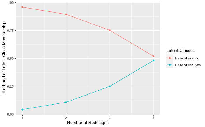
Likelihood of class membership by number of treatments
As the number of redesigns goes up, the likelihood of being in the “easy to use” group goes up and the likelihood of a user being in the “hard to use” group goes down. This is what we’ve been looking for all along: a way to use our two outcomes that we can measure to capture a hidden class that we can’t directly measure.
So now we have some pretty convincing evidence that there are two groups and that the number of redesigns affects which one a user might fall into. Might not seem super exciting but having proof that what you think is happening is in fact happening makes having conversations about what to do next significantly easier. As designers, we love to tell qualitative stories, but we also have to remember that sometimes we need tell quantitative ones as well.
What I want you to take away from this article (and the previous) is that when we get complex data from an experiment that doesn’t measure exactly what we’re looking for, it’s easy to say that we can’t infer anything from it. But I think that this is the wrong intuition. With some clever statistics and a little exploration, we can see what lies underneath the things that we can measure and that should make us more confident that our designs and work did what we thought they would do and that we can get a clear direction from the experiments that we’ve been running. This helps us measure how well our designs and makes us better designers in the process.